Learning with Subset Stacking (LESS)
LESS is a new supervised learning algorithm that is based on training many local estimators on subsets of a given dataset, and then passing their predictions to a global estimator. This is, of course, a rough description of LESS. In the second part of this tutorial, we will give more details about the inner workings of LESS and discuss how to change its many parameters to obtain different models. But for now, let us carry on with the default LESS and show that it works just fine out-of-the-box.
Imports
First, we need to import the necessary libraries. Apart from standard data manipulation and plotting libraries like numpy, pandas, matplotlib, and seaborn, we import various regression models from scikit-learn, xgboost, and lightgbm for comparison. Most importantly, we import LESSBRegressor from the less package.
import numpy as np
import matplotlib.pyplot as plt
import seaborn as sns
import pandas as pd

from sklearn.ensemble import RandomForestRegressor
from sklearn.neighbors import KNeighborsRegressor
from sklearn.tree import DecisionTreeRegressor
from sklearn.svm import SVR
from sklearn.linear_model import LinearRegression
from xgboost import XGBRegressor
from lightgbm import LGBMRegressor
from less import LESSBRegressor

from sklearn.model_selection import train_test_split
from sklearn.metrics import mean_squared_error
from sklearn.preprocessing import StandardScaler
from sklearn.datasets import fetch_openml

import warnings

warnings.filterwarnings("ignore")
np.random.seed(42)
Synthetic Dataset
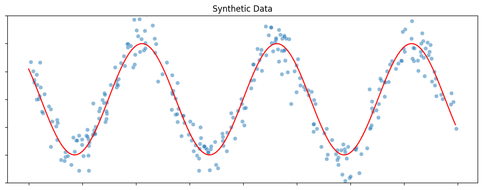
Here is a simple one-dimensional regression problem. This synthetic dataset is generated by randomly sampling a set of points from the real line (input) and then adding perturbations to their function values obtained with a sine curve (output). The blue dots in the figure below shows the dataset with 300 samples.
def synthetic_sine_curve(n_samples=300):
    plt.figure(figsize=(10, 4))

    # Generate data
    X = np.random.uniform(-10, 10, (n_samples, 1))
    y = 10 * np.sin(X[:, 0]) + 2.5 * np.random.randn(n_samples)

    # Plot
    xvals = np.arange(-10, 10, 0.1)
    sns.lineplot(x=xvals, y=10 * np.sin(xvals), color="red")
    sns.scatterplot(x=X[:, 0], y=y, alpha=0.5)
    plt.ylim([-15, 15])
    plt.title("Synthetic Data")
    plt.tick_params(labelbottom=False, labelleft=False)
    plt.tight_layout()
    plt.show()

    return X, y

X, y = synthetic_sine_curve()
Training LESS
You will notice that LESS uses exactly the same syntax (fit & predict) that is used by all the learning algorithms in scikit-learn. Currently, LESS only supports regression. We are working on adding the LESS classifier.
Data Preprocessing:
Before training, we split the data into training and testing sets. We also scale the features using StandardScaler. Scaling is often a good practice in machine learning, especially for algorithms that rely on distance metrics (like k-NN, which might be used as a local estimator in LESS) or gradient-based optimization. It ensures that all features contribute equally to the result.
X_train, X_test, y_train, y_test = train_test_split(
    X, y, test_size=0.2, random_state=42
)

scaler = StandardScaler()

X_train = scaler.fit_transform(X_train)
X_test = scaler.transform(X_test)
Fitting the Model:
We initialize LESSBRegressor with a random state for reproducibility. Then we fit the model to the training data and evaluate it on the test set.
LESS_model = LESSBRegressor(random_state=42)
LESS_model.fit(X_train, y_train)
y_pred = LESS_model.predict(X_test)

print(f"Test error of LESS: {mean_squared_error(y_pred, y_test):0.2f}")
Test error of LESS: 4.65
Comparison with Other Models
To see how LESS performs compared to other popular regression algorithms, we define a list of models including Random Forest, LightGBM, k-NN, Decision Tree, SVR, Linear Regression, and XGBoost.
models = [
    LESSBRegressor(random_state=42),
    RandomForestRegressor(random_state=42),
    LGBMRegressor(random_state=42, verbose=-1),
    KNeighborsRegressor(),
    DecisionTreeRegressor(random_state=42),
    SVR(),
    LinearRegression(),
    XGBRegressor(random_state=42),
]
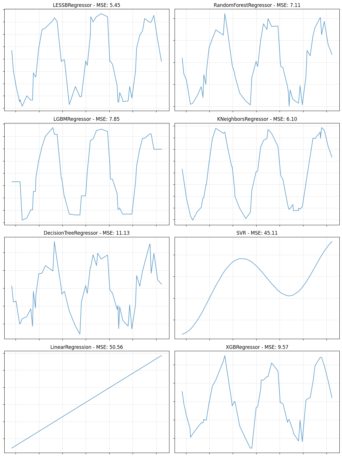
We then iterate through these models, train them on the same data, and plot their predictions (or compare their MSE scores). This visual comparison helps in understanding how different models capture the underlying pattern of the data.
def compare_models(X_train, X_test, y_train, y_test, models, plot="line"):
    """
    Compare multiple models by plotting their predictions or scores.
    plot="line": Creates a subplot grid showing X vs predicted values.
    plot="bar": Creates a bar chart showing MSE scores.
    """
    if plot == "bar":
        # Calculate MSE for each model
        model_names = []
        mse_scores = []

        for model in models:
            model.fit(X_train, y_train)
            y_pred = model.predict(X_test)
            mse = mean_squared_error(y_test, y_pred)
            model_names.append(model.__class__.__name__)
            mse_scores.append(mse)

        # Create bar plot
        plt.figure(figsize=(12, 6))
        bars = plt.bar(range(len(model_names)), mse_scores, alpha=0.7)
        plt.xticks(range(len(model_names)), model_names, rotation=45, ha="right")
        plt.ylabel("MSE")
        plt.title("Model Comparison - MSE Scores")
        plt.grid(True, alpha=0.3, axis="y")

        # Add MSE values on bars
        for bar, mse in zip(bars, mse_scores):
            plt.text(
                bar.get_x() + bar.get_width() / 2,
                bar.get_height(),
                f"{mse:.2f}",
                ha="center",
                va="bottom",
                fontsize=10,
            )

        plt.tight_layout()
        plt.show()

    else:  # plot == "line"
        # Calculate grid size
        n_models = len(models)
        n_cols = 2
        n_rows = (n_models + n_cols - 1) // n_cols

        # Create subplot grid
        fig, axes = plt.subplots(n_rows, n_cols, figsize=(12, 4 * n_rows))
        axes = axes.flatten()

        # Plot each model
        for idx, model in enumerate(models):
            # Train and predict
            model.fit(X_train, y_train)
            y_pred = model.predict(X_test)
            mse = mean_squared_error(y_test, y_pred)

            # Sort for line plot
            sort_idx = X_test[:, 0].argsort()
            X_sorted = X_test[sort_idx, 0]
            y_pred_sorted = y_pred[sort_idx]

            # Plot
            ax = axes[idx]
            ax.plot(X_sorted, y_pred_sorted, alpha=0.7)
            ax.set_title(f"{model.__class__.__name__} - MSE: {mse:.2f}")
            ax.tick_params(labelbottom=False, labelleft=False)
            ax.grid(True, alpha=0.3)

        # Hide extra subplots
        for i in range(len(models), len(axes)):
            axes[i].axis("off")

        plt.tight_layout()
        plt.show()
# Run comparison
compare_models(X_train, X_test, y_train, y_test, models, plot="line")
Experiment with Abalone Dataset
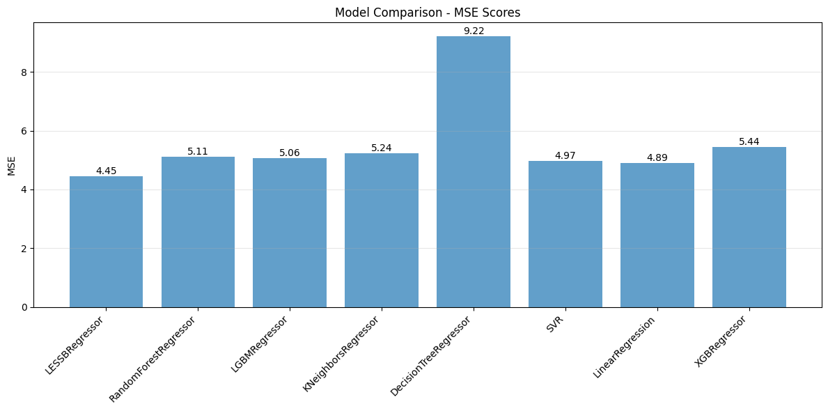
Let’s try with a larger dataset. We will use the Abalone dataset which has 4177 rows and 8 columns.
abalone = fetch_openml(name="abalone", version=1, as_frame=True)

X = pd.get_dummies(abalone.data, drop_first=True, dtype=np.float32)
y = abalone.target.astype(np.float32)

X_train, X_test, y_train, y_test = train_test_split(
    X, y, test_size=0.2, random_state=42
)

scaler = StandardScaler()

X_train = scaler.fit_transform(X_train)
X_test = scaler.transform(X_test)
We can also compare the models based on their Mean Squared Error (MSE) using a bar chart.
# Run comparison with bar plot
compare_models(X_train, X_test, y_train, y_test, models, plot="bar")